From Inconsistency to Coherence: Building the Epicurean Design System for Resy
Design Systems
UI/UX Design
Duration
3 months, Fall 2025
Team
3 Product Designers
What I did
UI design, variable and interactive component setup in Figma, usability testing, system building in Zeroheight.
Problem
Resy is great at booking tables, but its interface doesn’t feel as refined as the food on tables.
Resy is a popular restaurant reservation platform that helps diners discover and book tables at thousands of restaurants worldwide. At first glance, Resy feels modern and well-designed.
However, when we evaluated the site more closely through a designer’s lens, the interface shows noticeable inconsistencies that subtly disrupt the experience:
1
An unexpected variety of icons and colors are used across the interface.
2
Multiple spacing and layout patterns make the flow hard to follow.
3
Inconsistent interaction states fail accesssibility standards.
To address these inconsistencies at scale, the most effective solution is a design system. A design system brings together reusable components, patterns, and styles, paired with brand guidelines, UX principles, and technical documentation. It ensures consistency, efficiency, and quality across the product as it evolves.
Final Product
Meet Epicurean Design System: build and scale with confidence through the UI kit and documentation site.
The word epicurean describes someone who deeply appreciates fine food and sensory experiences, with refinement rather than excess.
Just as Resy connects diners to their next favorite restaurant, the Epicurean design system delivers refined digital experiences through thoughtful, consistent design.

What Epicurean brings to the table
“Design systems are culture change disguised by a UI kit.”
- Lauren Loprete
Epicurean is more than a collection of components. It establishes a shared language across product designers and developers, enabling clearer communication and more efficient collaboration.
Guided by a set of core principles, the system provides a unified way to build and scale products:
Efficiency
1
Accelerate feature delivery through reusable assets and patterns.
Consistency
2
Ensure a cohesive user experience and reduce decision fatigue.
Frugality
3
Minimize wasted time and resources by prioritizing simplicity and reusability.
Transparency and Clarity
4
Foster trust and ease of use through clear, accessible documentation.
Accessibility and Inclusivity
5
Commit to WCAG compliance and thoughtful, inclusive design from the start.
What we built
We created two core artifacts that work together to support scalable, consistent design:

🌟 What I contributed
Deconstruction
1
I was in charge of analyzing existing form elements, pop up/modals, and all interactive elements to identify patterns, inconsistencies, and opportunities.
Design Elements
2
I was primarily responsible for icons, layout grids, circle buttons, and interactive elements such as menus, tooltips, and accordions.
Formatting Documentation
3
I set up scalable outlines and formatting examples for all documentation, while writing all supportive pages, such as the get started, contact us, and contribution pages.
Deconstructing the System
The ingredients were plentiful, so we sorted through them to uncover patterns and gaps
Before designing the system itself, we needed to understand what already existed. That meant identifying the current functionality of the Resy website and the UI elements used across its interfaces.
We began by reviewing all MVP pages and capturing screenshots of every visible UI element, compiling them into a comprehensive inventory.

Our inventory from deconstructing Resy’s interface.
Icons
Color
Typography
Media
Buttons and CTA
Layout
Blocks
Interactive Elements
Popups and Modals

Design Tokens
Establishing the technical foundation — tokens.
Although our team shared a strong visual design background and instinctively aligned on how the product should look and feel, we lacked a formal style guide to support consistent decision-making.
To create a reliable foundation, we defined design tokens in Figma and treated them as our single source of truth for color, typography, and spacing.
With these, our team could design confidently without hesitation or ambiguity, while also providing developers with a clear, shared visual language to build from.

Color Variables

Typography Variables

Spacing Variables
Token Structure
To make the design system scalable and maintainable, we organized tokens into three layers: primitive, semantic, and component tokens, which distinguish raw values from meaningful usage and component-specific rules, and eliminated design debts from updates or theme changes.

⚠️ Challenges
This stage was one of the most challenging parts of the project. There is no single “correct” way to build a token system, and the abundance of tutorials and naming conventions made early decisions feel especially complex.
To stay grounded, we aligned on a guiding logic first and began with color tokens before expanding to spacing.


Brainstorming our color tokens
While I focused on spacing tokens, several questions surfaced, including:
Should we use outer padding or margins for spacing between elements?
Should we reuse component tokens and assign multiple alias/semantic tokens to each?
How does responsive design affect the use of alias/semantic tokens?
✅ Our approach
Given the scope of the project and the absence of direct development collaboration, we chose to move forward with a clear, foundational set of color, typography, and spacing tokens.
Components and Patterns
Designing from atoms to molecules
We started by creating our foundations library, including grid, colors, typography, media, and iconography.
While our component library is built on these foundations with reusable UI elements designed for flexibility and scale. I was primarily responsible for icons, layout grids, circle buttons, and interactive elements.
Important design decisions I made along the way
1
Saving time with predesigned icons
To accelerate progress, I reused existing SVG icons from the Resy website and resized them for multiple use cases. While scaling icons is not always ideal, this approach allowed us to deliver a cohesive version 1 of the system.
For action icons, we referenced Polaris’s iconography due to its completeness and close alignment with RESY’s visual language.

2
Setting conventional breakpoint grids
I established a 12-column responsive grid system based on common breakpoint standards. This allowed content to expand and collapse predictably across screen sizes, supporting responsive layouts without added complexity.

3
Bringing consistent interactive states to circle buttons
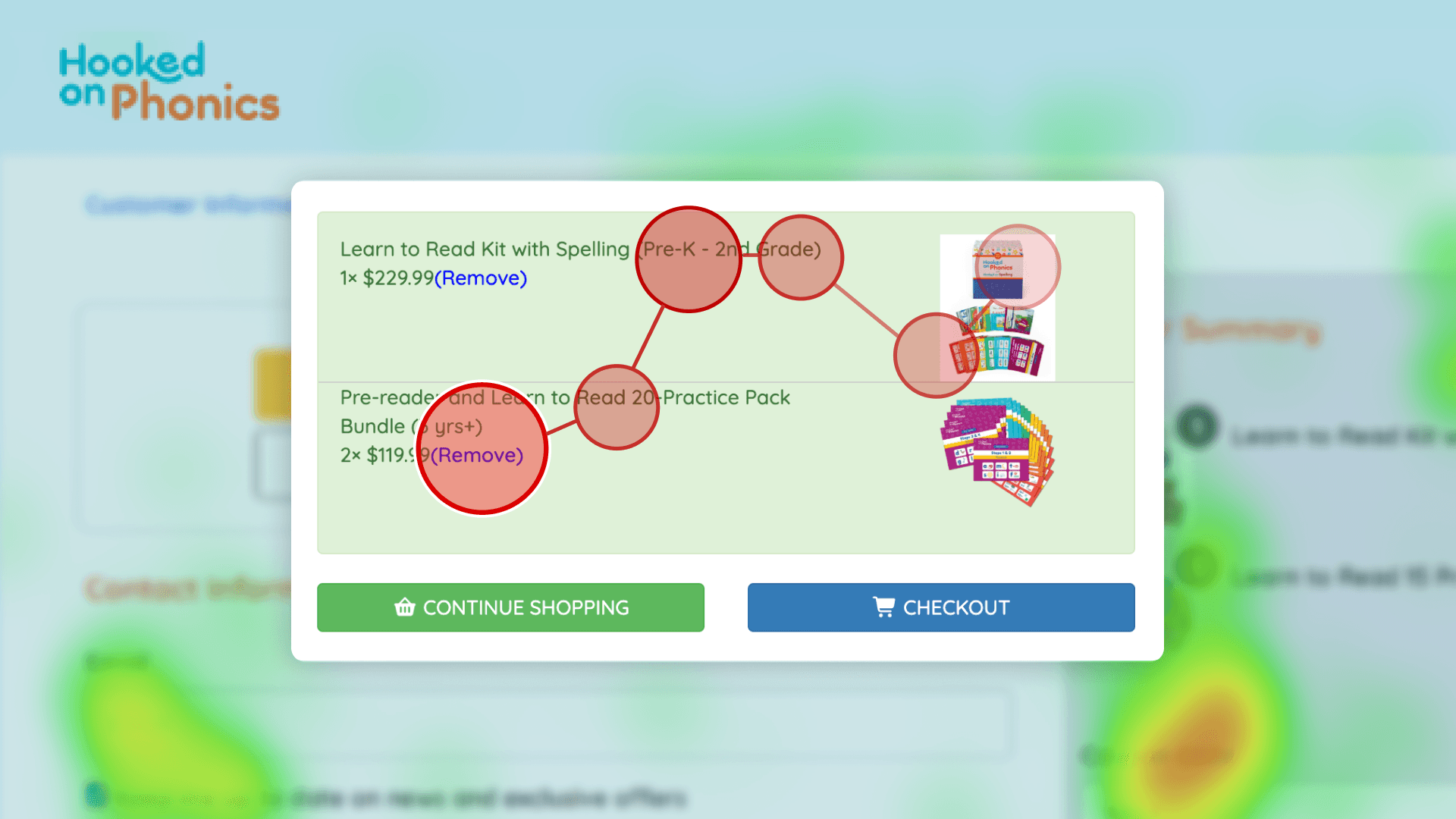
Circle buttons play a key role in Resy’s experience, enabling diners to select dates, view availability, and navigate search categories.
I aligned their sizing, typography, and states with the existing rectangular buttons, while introducing a selected state to better support date selection and active filtering.

4
Applying best practices to text input design
Parallel to this project, I was researching web form usability, which helped inform several design decisions. For example, help text was placed outside input fields to prevent it from disappearing as users typed, and validation states were clearly defined below the boxes. These choices aimed to balance user control with flexibility for future implementation.

If components are atoms, patterns are molecules
Our pattern library included elements such as card groups, carousels, modals, and other grouped content structures.
By formalizing patterns, we ensured that commonly repeated layouts could be reused consistently, reducing design debt and making the system easier to expand as new features are introduced.

I led the design of the filter and menu patterns.
Filters appeared on individual restaurant pages to support browsing.
Menus were revealed contextually when users interacted with the search bar.

Testing and Iterations
Testing with designers revealed the need for stronger patterns
We asked product designers in our personal network to recreate the Resy homepage using the Epicurean UI kit. Through these informal, moderated usability tests, we identified friction points that guided our iterations.


I facilitated one moderated usability test. (I'm the one in the maroon sweater)
Key iteration decisions
Reordered variable collections for faster access
We moved frequently used text variables higher in the hierarchy and placed primitive scale variables lower to reduce visual clutter.Shifted layout styles into variables
Layout styles should be defined as variables rather than as components, and all components should be aligned to the column grid system to ensure consistency.Expanded the pattern library
We introduced additional patterns, such as hero sections on the homepage and on individual restaurant pages, to enable faster page creation.
These changes significantly improved efficiency. In follow-up testing within our team, the time required to recreate the homepage dropped from 10+ minutes to under 5, demonstrating the impact of clearer structure and more robust patterns.

Our inventory from deconstructing Resy’s interface.
Documentation
What’s a product without a manual?
A design system is a shared language, and like any language, it needs clear rules and guidance. Documentation provides the context, constraints, and best practices needed to use the system correctly to maintain consistency and ensure accessibility compliance across teams and products.
We chose Zeroheight as our documentation platform because it is purpose-built for design systems. Its WYSIWYG editor also allowed us to build and iterate quickly, keeping documentation aligned with the evolving UI kit.
Together, the UI kit and documentation ensure that Epicurean is not just usable, but scalable, flexible, and easy for teams to adopt.
Next Steps
Version 1 released: imagining the future of Epicurean
With version 1 of Epicurean released, we explored how a design system team at Resy could continue evolving the system over time.
By starting small, testing early and often, and baking responsiveness into the system from the outset, Epicurean can grow incrementally while staying aligned with real product needs.

Epicurean product roadmap
Equally important is design system governance. Treating Epicurean as a living product requires clear ownership, early socialization across teams, and a defined plan for maintenance and iteration.
Establishing a dedicated team and shared contribution model would encourage adoption, support long-term consistency, and ensure the system evolves alongside Resy’s business and user needs.
Outcome
The design system pitch engaged stakeholders and sparked excitement
Through our pitch deck, we clearly communicated why a design system matters, how it supports efficient cross-functional collaboration, and how Epicurean could evolve as a living product over time. The presentation walked stakeholders through both the system’s structure and its long-term value.

My teammates and I after the final pitch. With me on the left, Shreesa in the middle, and Myra on the right
Members of the product design team responded positively to the work and expressed excitement about using the system in practice. Feedback included:
“The short onboarding section was very helpful and practical for future use.”
“Inviting us to contribute to the design system feels hopeful and welcoming.”
“Your delivery was very engaging, it made us want to learn more about the product.”
Note
It’s important to note that this presentation was delivered as part of a course final. Classmates were assigned the role of fictional stakeholders and provided critiques on both the product and the presentation, offering valuable perspectives on clarity, usability, and adoption.
Learnings
I learned that building design systems is as much about people as it is about design
1
Design systems are large, long-term efforts that require dedicated ownership.
Over three months, our team built the foundation of the Epicurean design system, but the process made it clear how much work remains beyond an initial release. Design systems are living products that require ongoing maintenance, governance, and iteration.
Working in a team of 3 helped me appreciate the scale of effort needed to support a system across an entire organization, especially as teams and products grow.
2
A design system isn’t complete without developers.
While we were able to create robust components and patterns in Figma, the absence of a coded implementation highlighted an important gap.
In past experiences, I’ve seen teams rely on UI kits without a formal system, leading to inconsistencies and repeated design decisions. This project clarified the value of integrated design and engineering collaboration, and strengthened my interest in contributing to design systems that are built, implemented, and maintained across both disciplines.
About the Team
Couldn’t have done it without my team!
Special thanks to my team, Myra and Shreesa. Working with you for three months was both productive and rewarding.
Our discussions were thoughtful, ideas flowed easily, and we continually learned from one another. The strong team dynamic made the collaboration enjoyable and strengthened the quality of the work throughout the project.